The Museum of Broken Systems
Overview
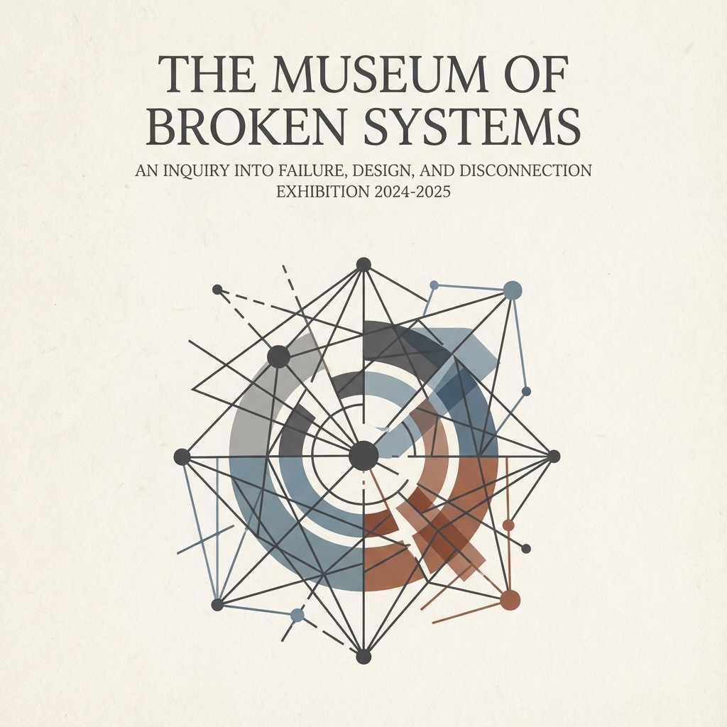
The Museum of Broken Systems is a digital installation designed to reframe how we view technical failure. Instead of treating bad UX as "bugs," this project curates them as "artifacts of decision-making." Using a quiet, editorial aesthetic inspired by physical museums, I invite users to reflect on the human cost of administrative design choices in education, healthcare, and civic tech.
The Curatorial Concept
In our industry, we often obsession over "frictionless" experiences. But for many users - students navigating financial aid, patients seeking care—the systems they rely on are defined by friction.
I wanted to build a portfolio piece that wasn't just another "app redesign," but a critical inquiry.
Design Pillars
- Dignity over Speed: The UI forces a slow pace. No loud animations.
- Artifacts, not Screenshots: Interfaces are framed like paintings to encourage scrutiny.
- Systemic View: Focusing on the policy/logic behind the screen, not just the pixels.
Visual Direction
To achieve the feeling of a "Museum," I moved away from the typical SaaS aesthetic (blues, gradients, sans-serifs) and embraced a print-editorial style.
Typography
Cormorant Garamond provides an elegant, authoritative voice typical of museum placards, contrasted with clean Inter for data.
Color & Texture
An off-white, parchment-like background (#F2F0E9) creates warmth and reduces eye strain, signaling a place for reading and reflection.